A customizable dashboard, multi-file upload, built-in galleries, one-click plugin upgrades, tag management, built-in Gravatars, full text feeds, and faster load times sound interesting? Then WordPress 2.5 might be the release for you. It’s been in the oven for a while, and we’re finally ready to open the doors a bit to give you a taste.
For the past few months, we’ve been working with our friends at Happy Cog — Jeffrey Zeldman, Jason Santa Maria, and Liz Danzico — to redesign WordPress from the ground-up. The result is a new way of interacting with WordPress that will remain familiar to seasoned users while improving the experience for everyone. This isn’t just a fresh coat of paint — we’ve re-thought the look of WordPress, as well as how it’s organized so that you can forget about the software and focus on your own creative pursuits.
Here are a few vignettes of what’s in store.
The Dashboard

The Dashboard’s most important role is to inform quickly and get you to where you’re headed in the admin. In interviewing users, we found that most of you ignore the Dashboard entirely — its useful information being mostly hidden in an overly complex design. The new Dashboard is focused on the most relevant tasks at hand: a quick summary of what’s published and scheduled for publication, the latest comments and incoming links, blog stats, and WordPress updates and news. You can add your own RSS feeds and edit the way information is presented so that the new Dashboard conforms to the way you use WordPress.
Navigation

The WordPress navigation has confounded even sophisticated users. With the new design, we’ve cut the number of navigation options in half, separating the primary functions (writing, managing posts and pages, editing the blog’s design, and managing comments) from secondary functions. This presents information at a more comfortable pace, revealing only the information that’s necessary. Everything you need is still there — just better organized. (Especially for people new to WP.)
Write
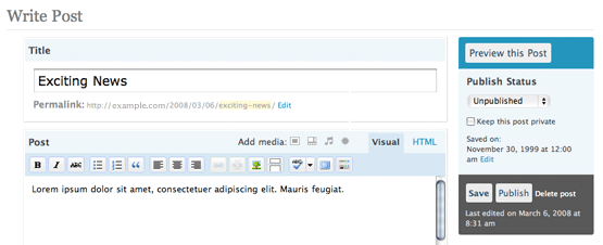
By far, the most frequently accessed part of WordPress is the Write screen. It gets the job done, but its myriad options can be overwhelming. The new write screen only displays the information that you’ll use most often. It displays the most common fields in a way that makes posting incredibly easy. Additional options are hidden away until you need them. The new Write screen anticipates the natural flow of the way you write, and is smart enough to remember the way you left it so that your preferred writing environment is always quickly available. The new visual editor even has a handy full-screen mode to help block out distractions while composing your newest post. (My personal favorite new feature.)
Manage
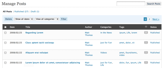
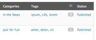
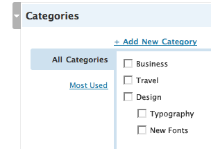
The Manage screens have been redesigned and unified so that now, managing your pages, posts, media, and comments all use similar, consistent interfaces. We’ve omitted superfluous information and made what’s important faster to find. We believe these changes will make you a faster, more proficient blogger.
You might also notice there are some new colors, the dashboard feels much fresher and lighter. If you’re jonesing for the old look under your user options you can now select the “classic” colors and get those old blues back. (It’s also pluggable so people can easily add or share their own color schemes.)
If you make frequent backups and you’re interested in helping us out with development by testing the new code, download and install Release Candidate 1 of WordPress 2.5, and join our testers mailing list to report any bugs you find in the code.
We’re also interested in feedback on the new interface and would love to hear your opinions, thoughts, rants, raves, and anything in between. We created a special email address just for the occasion: 2.5-feedback@wordpress.org.
The software is basically done and stable, and could be released today, but we’d like to incorporate feedback from a wider audience before making it available to the general public. After a few days of your feedback we’ll set a final release date. Personally, I can’t wait. ![]()
